Form meets function. Art meets science.
What brings it all together?
Architecture is not just about creating beautiful buildings. Nor is it about basic pragmatics. It is at its best, a blend of both. How do architects navigate between these words? It begins with understanding the foundational principles of design. Understanding and applying these principles helps designers navigate the complexity of the process, juggling between the left and right brain activities that are necessary to bring together a building.
How are the principles of architecture defined?
When we talk about the principles of architecture, we are talking about fundamental tools and skills. They are guidelines that influence how we as designers come up with a design and refine it through the architectural design process.
Do all designers follow all these principles with every design? Probably not, for better or for worse. Are they something we are consciously thinking about all the time? Not necessarily. To a certain extent, they become part of you; an innate part of your process. On the other hand, it is great to have a list of core principles to refer back to throughout the process, to check in with if something isn’t looking quite right, or as tools to work through when testing out new ideas or design concepts.
Why Are Architecture Design Principles Important?
In Architecture, as in life, having principles is important. Having a set of tools and criteria prevent you from getting lost in the sea of infinite possibility. They guide decisions, spark ideas and give structure to the challenges of bringing together the practical and the beautiful.
Architecture Design Principles
We break down our design principles into five main categories. These deal with composition and spatial design, helping to organize your floor plans and elevations, and overall what the building will look and feel like. There are other sets of principles that are also good and relevant. Vitruvius’ triad of Strength, Utility and Beauty remain the core fundamentals of architecture in the big picture. But from a design standpoint, we go back to these five to guide our process.
1. Principle of Balance
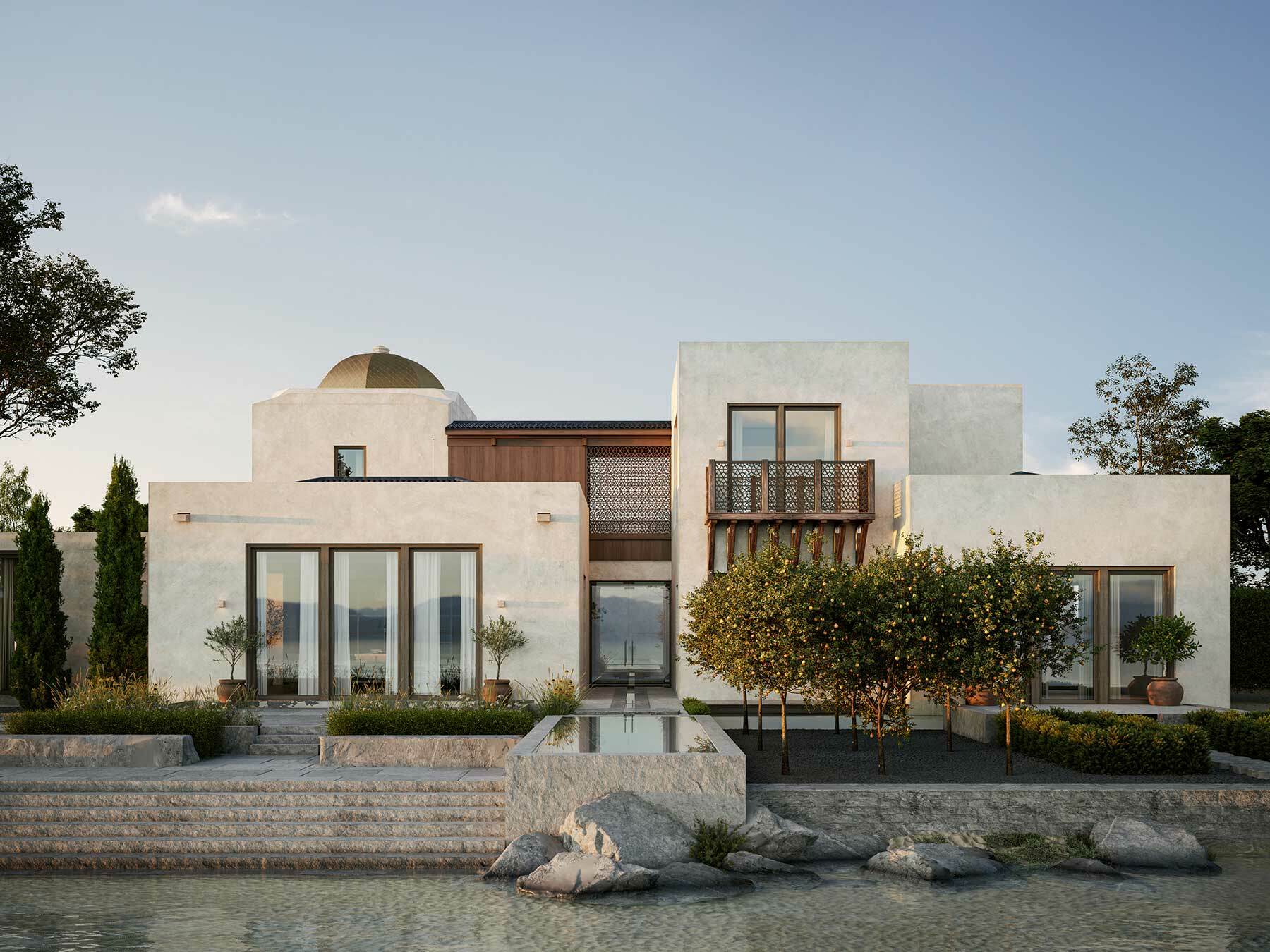
It’s all about balance. Balance in architecture is the distribution of visual weight, and how the size, shape and scale of the elements relate to each other. Balance provides a sense of stability and order, whereas an imbalanced design can feel off or uncomfortable. Balance is visual but also sensory. It is part of how you experience a building or space (or any design composition). It can be achieved through symmetry, asymmetry, or radial balance.
- Symmetrical Balance: This type of balance involves mirroring elements on either side of a central axis. Symmetrical balance is often used in classical or formal architecture. You’ll see many traditional civic and religious buildings, and also in residential work of all scales where a sense of order and elegance is appropriate.
- Asymmetrical Balance: In asymmetrical balance, elements are arranged to create equilibrium without being identical on both sides. Rather than identical elements on either side of the axis, the composition will balance two different elements that have the same or similar visual weight, or one large element with a collection of smaller elements. Asymmetrical balance is less formal, and lends itself to vernacular design that still aims for order. Many cathedrals have different towers that flank the central entry, but keep the focus on the central entry.
- Radial Balance: This is a type of balance you’ll see more often in horizontal floor plans than in vertical facades. Round or octagonal floor plan layouts can have an axial symmetry but also be designed with a hierarchy that radiates outward from the center.
It’s worth noting that even in a totally asymmetrical design, which is common in many styles of vernacular or cottage houses, the individual elements will often have a symmetrical composition. This helps with order and hierarchy, as we’ll discuss below.
2. Principle of Emphasis
Emphasis and hierarchy have a functional and practical purpose, in addition to being an ordering system that helps design the relationships between the elements.
First and foremost, you start by creating a focal point (or points) or a dominant element that draws attention. Ideally this isn’t a random decision. You want to emphasize what’s most important, whether it’s the entrance, a central feature, or a unique architectural detail. From a practical standpoint, it makes sense to use emphasis to guide people through the building. Emphasizing the main entry on the front elevation structures the approach. Not being able to find the door on a building can be frustrating.
Once you move people into the building, emphasis can shift. Are you looking to guide them to a destination, or set up an experience? You might also want to emphasize a view, or highlight artwork. In whatever case, you want to think about the main purpose for a space and think of how to bring that to the forefront by using techniques of emphasis.
Creating emphasis can be achieved through various techniques. Here are a few:
- Contrasting Colors or Materials: Using different colors or materials can highlight specific areas of a building. A bright red or yellow front door. A change of floor material between public rooms or circulation paths and private rooms
- Lighting: Strategic lighting can emphasize certain architectural elements, drawing attention to them. Lights on either side of the front door, or shining spotlights on a painting or sculpture, or down on top of a coffee table add atmosphere and ambiance.
- Scale: By making certain elements larger or more prominent, architects can create emphasis within a design.
- Ornamentation and detail: Emphasis and hierarchy can be established by using a higher level of detail to establish the importance of an element. Doors, for example, can be the same size, but adding a more detailed frame will signify that it leads to a more important room. More detail and higher-end materials are often used on the facades of a building that face a main street, while facades facing alleys and side streets are often simpler.
- Differentiation: In a pattern of similar objects, the one that is different will draw the eye to it.
Emphasis helps guide the viewer’s experience of a space, highlighting features and important elements, but also, in a practical sense, can help define the approach and the path of travel, helping to organize the design.
3. Principle of Proportion
Proportion is used to define relationships both between the elements of a design, and between the spaces and the user. A well proportioned space will feel good, like you’re meant to be there. Well proportioned elements related well to each other. We have a connection to certain geometric shapes and patterns. Theories vary as to whether this is innate or something we take in through our life’s experience, but proportions carry across different cultures in meaningful ways.
Proportion is often associated with the human scale. Buildings should be designed with the human experience in mind. This sounds obvious to say, but many forms of architecture have lost track of this thread, and the resulting buildings tend to lose appeal once a trend subsides.
- Human Scale: Proportions should match the size and dimensions of the human body to create comfortable and functional spaces. Architects have studied the connection between human proportion and the built scale throughout the centuries. See DaVinci or Le Corbusier, to name a couple of more famous examples.
- Geometric Relationships: Some architects use geometric patterns or ratios to create harmonious proportions. The golden rectangle and golden ratio are often used to study floor plans and elevations. The study of sacred geometry can also guide a design. But even a mathematically perfect composition can be too large or too small and any design should ultimately test its proportions against the human scale.
The principle and study of proportion helps connect a design with the people that will use it. This is a timeless principle. The study of proportion connects a design to the history of architecture. We can tell when a building is working or not, if it feels right or not. Architects have studied proportion to explain why this is.
4. Principle of Rhythm
Rhythm in architecture refers to the repetition of elements in a design. like a drum beat in music. Similar to many of the other principles, this has aesthetic and practical value. Structurally, it’s easier to calculate and build when the design follow a regular spacing. Historically, this would often have been based on the dimension of materials, using consistent sizes of stone or brick to define spaces and place openings. Using a rhythmic spacing of columns also connects to principles of biophilia, which we have discussed in earlier articles.
There are several types of rhythm that architects use:
- Repetitive Rhythm: This involves repeating the same element, like windows or columns, at regular intervals to create consistency and order.
- Alternating Rhythm: Alternating rhythm introduces variation by changing elements in a consistent pattern. Alternating window pediments is an example you find across traditional buildings to add character and rhythm.
- Progressive Rhythm: Progressive rhythm gradually increases or decreases the size or frequency of elements, creating a sense of growth or movement. Most commonly you’ll find this progression moving vertically, with heavier, more solid elements at the ground level, getting lighter, smaller, more open or less detailed as you move up through the stories.
Generally, in architecture as in music and many things, we seek out pattern and rhythm as a way to understand the greater whole. There is a place to break with rhythm and regularity, but often it can lead to a sense of disorder and disorientation.
5. Principle of Movement
The principle of movement refers how we move people through a design. How we circulate through the spaces is part of it, but in a composition, it is also about making it come alive. We want the eye of the viewer to explore the design, finding direction in a practical sense, but also finding levels of interest and excitement. This relates to the principle of rhythm, but adds another layer. What is it that brings life to a space? Perfect consistency (think all-glass office parks), and total chaos both result in a bland, static experience. There is a sweet-spot where all the principles combine to create movement, interest and life.
This principle can be achieved through various design strategies:
- Layers of detail: Moving from large to small scale, adding different types and level of detail. Starting at the scale of the building, moving in to the scale of the smallest ornament, handle, knob, trim, accessory are designed and considered.
- Craft and quality: A level of intricacy and craftsmanship brings details and spaces to life.
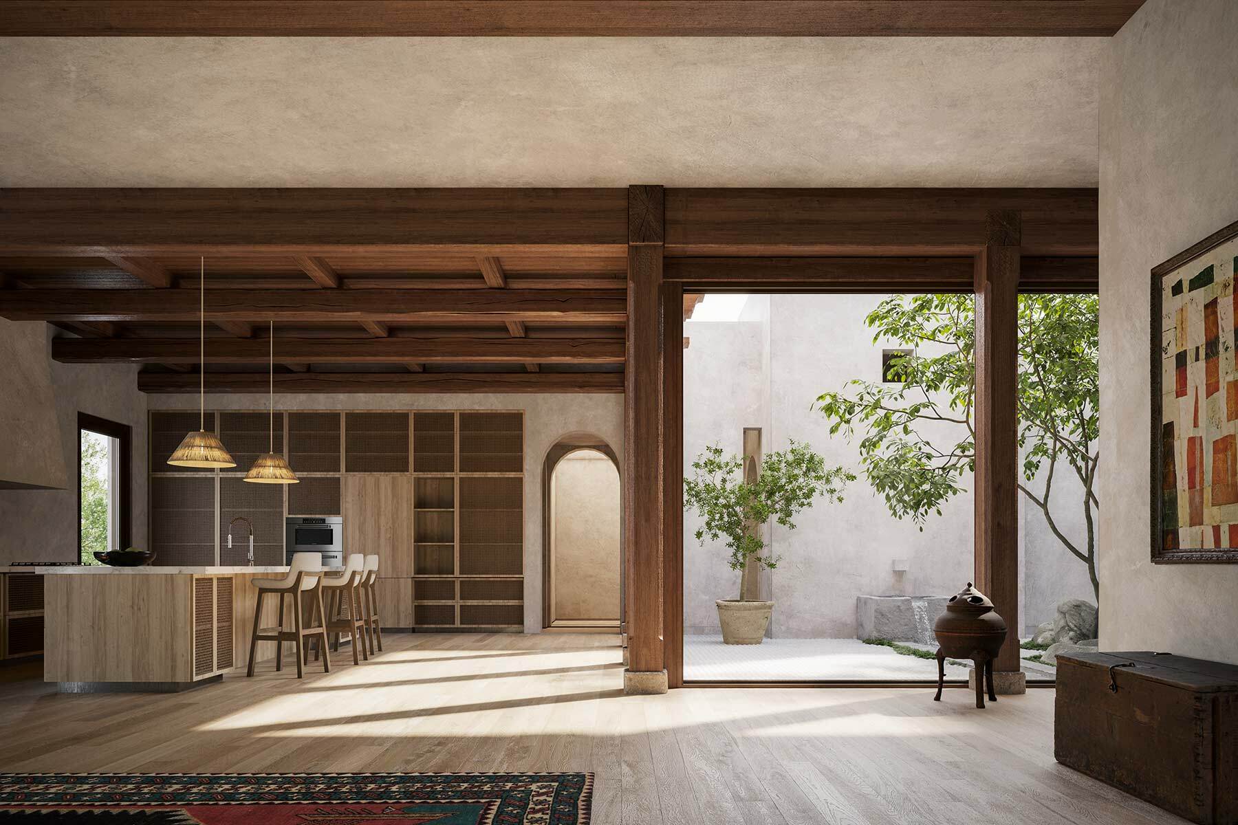
- Materials and textures: Using materials with natural variation, like wood, stone, plaster, and so on, bring a sense of life and movement to the experience.
- Light and Shadow: The play of light has always been part of the architect’s toolkit. This is obvious as part of how we design openings, and lighting concepts. But it is just as important as you step down through the layers of detail. The way we get gradients of shadow around a column or across the subtle curves and edges of a moulding profile add depth and movement that a viewer might not be able to explain.
Movement is not just about physical navigation but also about creating a story or emotional journey as people experience different parts of a building. It ties together with the other principles
The five fundamental design principles of architecture—balance, emphasis, proportion, rhythm, and movement—are part of both the conscious and sub-conscious design process. They are tools we use to design and to critique our designs. Different designers will use the principles differently, but they are tools to apply as needed, to organize thoughts, ideas, and make spaces function.